

Ever walked into a room and felt something was off, even though your furniture was perfect and your colors matched? The chances are high that your wall art is hung too high, too low, or just out of balance with the space. We’ve all been there—standing on a chair, holding a frame, wondering if it’s in the right spot. But here’s the thing: hanging pictures correctly is one of the simplest ways to transform a room from ordinary to extraordinary. In this guide, we’ll share the secrets to perfect picture placement so your walls finally look professionally designed.
The Golden Rule: Finding the Perfect Eye-Level Height
The most important rule for hanging wall art is simpler than you might think: aim for eye level. Generally, the center of your picture should sit between 57 and 60 inches from the floor. This creates a natural viewing experience that feels comfortable and intentional. However, don’t forget to account for furniture. If you’re hanging art above a sofa or console table, the bottom of the frame should be about 6 to 12 inches above the furniture piece. This spacing prevents the art from looking disconnected from the rest of the room while keeping it at a comfortable viewing height for seated positions.
Measuring and Marking: Tools You Need for Precise Placement
Getting the perfect placement starts with proper measuring, and you’ll need a few basic tools to do it right. A tape measure, pencil, painter’s tape, and a level are essential. Start by measuring the height of your frame, then divide by two to find the center. Measure 57 to 60 inches from the floor and mark that point. Next, measure from the top of your frame to the hanging wire or nail hole—this distance varies by frame style. Subtract that from your center mark, and that’s where your nail or hook should go. Use painter’s tape to position paper cutouts on the wall first, stepping back to visualize before committing to holes.
Grouping Multiple Pieces: Creating a Gallery Wall
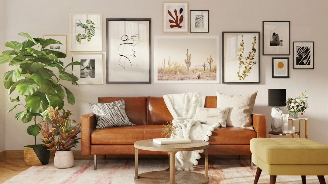
Gallery walls can feel intimidating, but they’re one of the most creative ways to showcase your personality. The key is to start with a plan: lay all your pieces on the floor first, experimenting with different arrangements until you find a composition that flows. Common approaches include aligning all frames at the same height, creating a grid pattern, or arranging pieces in a salon-style cluster. For spacing, aim for 2 to 3 inches between frames. Measure the overall width of your arrangement, then mark the wall accordingly. Working from the center outward helps maintain balance. Remember, gallery walls don’t require identical frame sizes—mixing orientations adds visual interest.
Considering Furniture Placement: Balancing Art with Your Sofa
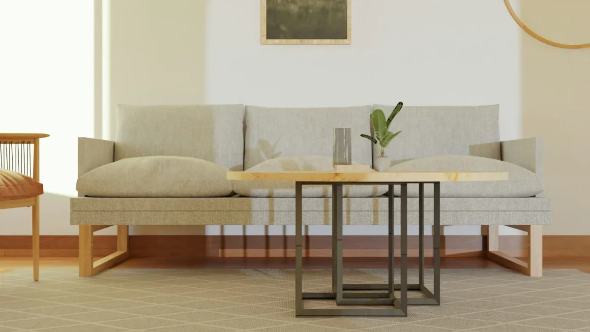
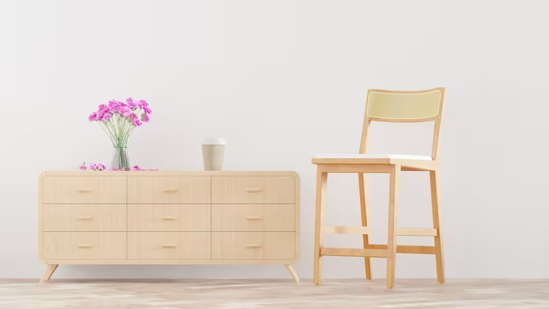
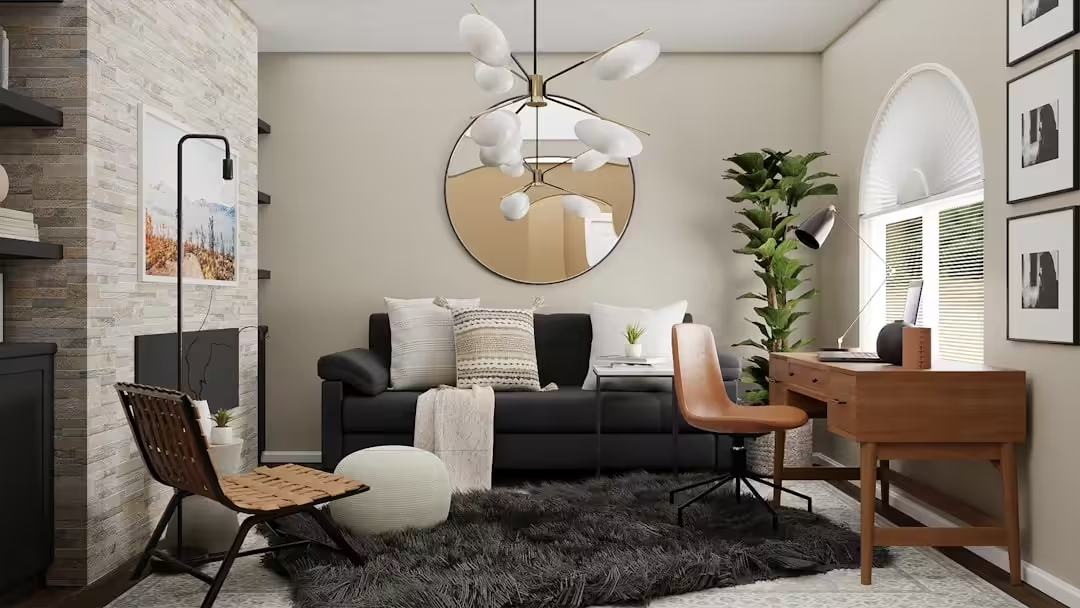
Wall art and furniture should feel like they’re having a conversation, not competing for attention. When hanging art above a sofa, the bottom edge of the frame needs enough clearance—typically 8 to 10 inches—to let the furniture breathe while remaining visually connected. The width of your art should be around two-thirds the width of your sofa for proper proportion. If you have multiple pieces, treat them as one unit and center them above the furniture. Don’t forget to consider the height of your furniture too. A low-profile sofa might allow for larger art, while a tall headboard might push your placement higher. The goal is harmony between all elements in the room.
Lighting Matters: Showcasing Your Wall Art
Even the most perfectly placed art can fall flat without proper lighting. Natural light can cause fading over time, so consider UV-protective glass for valuable pieces. For display, aim for lighting that illuminates the art without creating glare. Picture lights mounted above frames add a museum-like quality, while adjustable track lighting offers flexibility. Avoid placing art in direct sunlight unless you want that warm, faded look over time—unless that’s your intention. Dimmer switches let you control the mood, making your art feel dramatic in the evening and natural during the day. Good lighting transforms your wall art from decoration to a focal point.
Common Mistakes to Avoid When Hanging Pictures
Even experienced decorators make mistakes when it comes to picture placement, and that’s okay—but let’s learn from the most common ones. The biggest error is hanging art too high, which makes rooms feel cold and disconnected. Another frequent issue is hanging a single small piece on a large, empty wall, which can look lost or accidental. Don’t be afraid to go big or create a grouping. Using mismatched frames without intentionality can create visual clutter rather than curated charm. Also, avoid hanging art in direct line with doors or windows where it might get obscured. Finally, don’t skip the level check—a tilted frame immediately signals carelessness. Take your time, step back, and adjust before putting holes in your walls.
Frequently Asked Questions
What is the ideal height to hang wall art?
The center of your picture should typically sit 57 to 60 inches from the floor, which aligns with average eye level. Adjust based on furniture placement—leave 6 to 12 inches between art and furniture tops.
How do I center a picture between the floor and ceiling?
Measure your wall’s total height, find the midpoint, then position the center of your frame at that point. For standard 8-foot ceilings, this places the center around 48 inches from the floor.
How do I hang heavy frames without damaging walls?
Use wall anchors or molly bolts that match your wall type—drywall anchors for hollow walls,Toggle bolts for heavy pieces. Always check the weight rating and use a level to ensure straight placement.
What’s the best way to arrange a gallery wall?
Arrange pieces on the floor first to experiment with layouts. Maintain 2 to 3 inches between frames, work from the center outward, and consider using paper templates taped to the wall before hanging.
Should wall art be hung above furniture or on empty walls?
Both work, but above-furniture placement creates better visual balance. If using empty walls, go large with your art or create groupings to avoid a sparse, unfinished look.